
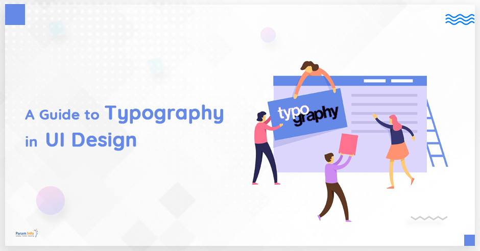
Whether you are planning to work for a reputable UI design company or finalizing the structure of your own website, learning about user interface designing is essential. In this blog, we are focusing on presenting a guide to typography, one of the hardest and most significant aspects of UI designing.
Contrary to what many of us believe, reading is still a significant aspect of our lives. When we say reading, it is not necessarily in reference to hardbound books. Think about it, most of the reading that we do today is on the web. We check websites, social media, read the news, and we are figuratively glued to our mobile screen all the time. All our exposure to these multimedia devices is facilitated by clean layouts, aesthetic designs, and easy-to-read content.
It is the concept of typographic science used efficiently by skilled UI designers that creates the ultimate web experience for you.
Typography and Significance of UI Design Company
Typography, in simple words, is the technique used by UI designers to arrange words and letters, while creating a clean yet stylized layout. It is often considered the hardest aspect of UI since effectively using all the typographic elements need patience and perseverance.
Designers use the typeface, line length, point size, kerning, Leading and many other elements to finalize the website layout. The primary goal of using typography is to provide a readable copy to the end-user. However, the role of typographic science in UI designing is not limited to just presenting the text in a concise format.
Developers engaged with UI design company have often claimed that 70% of the entire website design is dependent on effective utilization of typographic science. The relation between font’s visual presentation and the impact of communication on the end-user is important for designers to understand.
Effective use of Typography elements – fonts, color, size, and style – is how the designer can ensure the true meaning of the text is conveyed.
Using Important Elements of UI Design Services
Effective utilization of typographic science in UI design starts with learning all the elements involved. Let’s understand them:
TypeFace
Firstly, the difference between Fonts and Typeface should be clear as it may be confusing for many. While the former is the graphical representation of text, the latter is different styles of the Fonts, making it a part of the Typeface family. It is crucial that the Typeface selected suits to the tone of the business and meaning of the content.
Mean line and Baseline
Both mean line and baselines facilitate character placement in a particular text. For clarity and readability, it has been an ongoing tradition of placing the characters in a line. Both mean line and baseline help designers in maintaining a single line throughout the copy.
Measurements
To make the copy comprehensible and to differentiate between various information, the text usually follows separate measurements such as different size, weight, and height. This makes the copy coherent and highlights significant aspects.
White Space & Alignment
While reading, we hardly pay attention to aspects like the white space between the text. That’s not the case with designers as they end up spending huge time in adjusting the white space, which can really impact readability if not balanced properly.
Similarly, alignment maintenance also plays an instrumental role in creating the complete page layout and enhance the design.
Tracking & Kerning
Tracking is a tool to maintain the space between letters in a copy. A proper and balanced space maintains the text flow and makes it easier to read.
Kerning in Typography, on the other hand, allows the designer to adjust space between two specific characters without disturbing the space between others in the same copy.
Leading
We may not notice it while reading, however space between two lines impacts the entire layout and readability. Leading is how UI designers adjust the white space between two consecutive baselines. The standard leading reading is 120%, though it depends on the text position and the overall effect a designer is intending for.
Apart from these, using Typography would need you to get familiar with concepts such as Ascender and Descender. The extension of letters beyond the mean line and baseline is known as ascender and descender, respectively. These are useful in adjusting letters when they move beyond the middle point and can potentially disturb the entire text layout.
Conclusion
Even though these above-mentioned points can help you understand and learn how to use elements in Typography, the skill can be developed only through consistent practice. Working with a profession UI design agency can provide exposure to enhance your skills and work on real projects.
If you are looking for professional UI design services, contact ParamInfo’s UI experts – your one-stop solution for everything related to user interfaces and designing.