
Part 1 of this series covered the design principles, the metric framework, and the structure of the executive view for a KPI dashboard in an Executive Transformation Office. Part 2 moves into the harder questions: how to build the data infrastructure that makes the dashboard reliable, which tooling decisions matter most, how to handle the organisational dynamics that consistently trip up dashboard programmes, and how to measure whether the dashboard itself is working.
The best-designed metric framework delivers no value if the underlying data is unreliable, the tooling creates friction rather than clarity, or the organisation treats the dashboard as a reporting obligation rather than a decision-making instrument.
Building the Data Foundation Before the Dashboard
The most common reason transformation KPI dashboards fail in practice is not poor metric selection. It is poor data quality and disconnected data sources. A metric that looks clean on the dashboard but is built on unreliable data is worse than having no metric at all, because it creates false confidence at the executive level.
Before any dashboard tooling is configured, three data foundation questions must be answered.
Where does the data actually live? Employee performance data for a transformation context typically spans HR systems, project management platforms, learning management systems, ERP platforms, CRM systems, and collaboration tools. In most UAE enterprises, these systems are not natively integrated. The data model has to be designed to bring them together, and ParamInfo’s system integration services support exactly this kind of cross-platform data architecture for Gulf enterprises running heterogeneous technology environments.
How clean is the data? Before building dashboards on top of existing system data, audit the quality of the underlying records. Missing values, inconsistent naming conventions, duplicate records, and stale data are all common in HR and project systems that have grown organically over years. Building a KPI dashboard on top of unaudited data produces metrics that cannot be trusted, and once an executive loses confidence in a metric, it is very difficult to rebuild.
Who is responsible for data accuracy? Every metric on the dashboard needs a data owner: a named individual whose responsibility includes ensuring the underlying data is current, complete, and accurate. Without data ownership, the dashboard degrades over time as systems are updated inconsistently and edge cases are handled differently across departments.
Tooling Decisions That Actually Matter
The dashboard tooling market is crowded, and the choice of platform is less important than most organisations assume when they start the process. The more important decisions are around data architecture, access control, and visualisation principles.
What to Look for in a Transformation Dashboard Platform
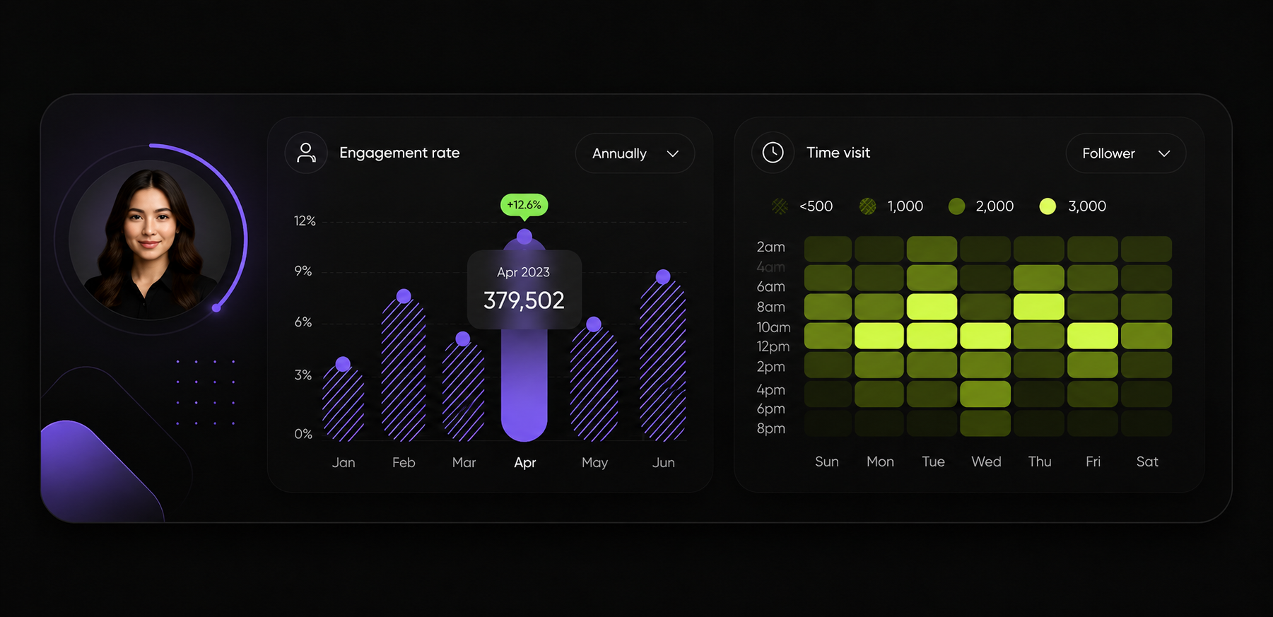
Real-time or near-real-time data refresh. A transformation dashboard that updates monthly is a reporting tool, not a decision-making instrument. For programme-level and operational metrics, daily refresh is the minimum. For adoption and activity metrics, near-real-time is worth the additional engineering investment.
Role-based access control. The executive view, the transformation office view, and the team leader view should each show a different level of detail. A well-configured dashboard platform enforces these access boundaries so that employees are not seeing each other’s individual performance data and executives are not distracted by operational granularity.
Embedded alerting. Waiting for a weekly dashboard review to detect that a critical metric has moved significantly in the wrong direction is too slow. A platform that can trigger automated alerts when a metric crosses a defined threshold gives the transformation office the ability to intervene between formal review cycles.
Mobile accessibility. Executive Transformation Office leadership in UAE and Gulf enterprises is not desk-bound. The executive view of the dashboard must be accessible and readable on a mobile device without losing critical information.
Integration with existing enterprise platforms. If the organisation is already running Microsoft 365, Oracle Fusion, or SAP, the dashboard platform should integrate cleanly with these systems rather than requiring manual data exports. ParamInfo’s Microsoft services team regularly implements Power BI-based executive dashboards that connect directly to Oracle, SAP, and Salesforce environments running across Gulf enterprises, eliminating the manual data consolidation step that undermines dashboard reliability in many organisations.
The Visualisation Decisions That Affect How Dashboards Are Used
The technical data architecture can be perfect and the dashboard can still fail if the visualisation choices make the information hard to read at a glance.
Keep the executive view to a maximum of six visualisations on a single screen. More than six requires scrolling or tab navigation, which reduces the likelihood that all metrics receive attention in a time-pressured review.
Use trend lines rather than single-period bars wherever possible. A single-period bar chart tells you the current value. A trend line tells you whether performance is improving or deteriorating and at what rate. Transformation offices need trend intelligence.
Colour conventions must be consistent and intuitive. Red for metrics below threshold, amber for metrics approaching the threshold boundary, and green for metrics on or ahead of target. Never use colour as the only indicator of status; add directional arrows or percentage variance annotations so the dashboard is still readable in environments where colour reproduction varies.
Avoid data density for its own sake. A visualisation that requires explanation before it can be read is not an executive-level visualisation. Every chart or indicator on the executive view should be self-explanatory to a new viewer within five seconds.
The Organisational Dynamics That Determine Whether Dashboards Succeed
Technology and data design alone do not determine whether an Executive Transformation Office KPI dashboard delivers value. The organisational dynamics around the dashboard are equally important, and they are more frequently the reason capable dashboards fail.
The Gaming Problem
When individual employee performance is visible on a dashboard and connected to consequences, the incentive to game the metrics increases. Employees optimise for what is measured rather than what the organisation needs. Training completion rates go up while learning quality stays flat. Adoption metrics tick over because employees log into new systems without genuinely using them. Cross-functional project participation rates rise while actual collaboration quality remains unchanged.
The mitigation is not to stop measuring. It is to design the metric set so that gaming one metric without genuinely improving performance makes adjacent metrics move in the wrong direction. Pairing process adoption rates with quality outcome metrics, for example, means that an employee who games the adoption metric by superficially using a new process will still show up in the quality data.
Transparency about the metric design also reduces gaming incentives. When employees understand what the transformation is trying to achieve and why the metrics are structured the way they are, the incentive to optimise for the measure rather than the outcome diminishes.
The Accountability Without Blame Problem
Executive transformation dashboards surface performance gaps. Some of those gaps will be attributable to specific leaders, teams, or functions. Creating a culture where the dashboard is used to assign blame rather than to diagnose and solve problems will cause the people most responsible for transformation delivery to treat the dashboard as a threat rather than a tool.
The transformation office should establish norms around dashboard use before the first review. The dashboard surfaces where attention is needed. The review conversation focuses on what needs to change and who can help, not on who is responsible for the current position.
ParamInfo’s IT staffing and consulting team has observed this dynamic repeatedly in transformation programmes across UAE enterprises, and the organisations that use dashboards effectively are consistently those that have invested as much in the governance model around the dashboard as in the technology that powers it.
The Dashboard Fatigue Problem
A well-designed transformation KPI dashboard starts as a decision-making instrument and can gradually become a compliance burden if the review process is not carefully managed. When reviews become routine, metrics lose urgency. When leadership stops acting on dashboard data between review cycles, the organisation learns that the metrics do not actually drive decisions.
Preventing dashboard fatigue requires two commitments. First, the dashboard must visibly drive decisions. When a metric triggers an intervention and the intervention produces a measurable improvement that appears in the next review, the dashboard has demonstrated its value. Second, the metric set should evolve as the transformation progresses. Metrics that are consistently green and stable can be retired or moved to an automated monitoring layer, freeing space for metrics that are more relevant to the current phase of the transformation.
Integrating the KPI Dashboard With HCM and Performance Management Systems
For a transformation KPI dashboard to be sustainable, it needs to be integrated with the organisation’s formal performance management infrastructure rather than existing as a separate transformation-only tool.
This integration has two dimensions.
Data integration: the dashboard pulls performance data from the HCM system, the learning management system, and the project and collaboration platforms, rather than requiring manual data consolidation. This keeps the dashboard current and removes the data maintenance burden from the transformation office.
Process integration: the insights surfaced by the transformation dashboard feed into formal performance review conversations, development planning discussions, and talent decisions. When the transformation dashboard and the performance management system operate in parallel without connecting, employees experience them as separate bureaucratic processes and engagement with both suffers.
ParamInfo’s piHCM human capital management platform is designed to integrate with both enterprise ERP environments and standalone analytics tools, giving UAE organisations a way to connect transformation performance data with core HR processes without requiring a bespoke integration build for every data source.
How to Measure Whether the Dashboard Itself Is Working
Transformation KPI dashboards should themselves be subject to a performance review process. The following indicators tell you whether the dashboard is functioning as a decision-making instrument.
Decision attribution rate: in each formal review, track how many of the agenda items and decisions made were informed by dashboard data. If the dashboard is not being cited in decisions, it is not working as a decision tool regardless of how good the data is.
Intervention response time: when a metric crosses a threshold and an alert is triggered, track how quickly the responsible team responds with a diagnosis and an action plan. Slow response times indicate that the alert mechanism is not being taken seriously.
Metric accuracy rate: on a quarterly basis, validate a sample of the metrics on the dashboard against the underlying source systems. If discrepancies emerge regularly, the data integration or data governance model needs attention.
User engagement with subordinate levels: if programme-level and operational-level metrics are never accessed between formal review cycles, the dashboard is being used as a reporting tool rather than a monitoring tool. Active dashboards see regular between-cycle access as team leaders and transformation managers check progress against targets.
Stakeholder confidence score: a simple quarterly question to dashboard users, including executives, transformation office staff, and team leaders, asking whether they trust the data and find the dashboard useful. Declining confidence scores are an early warning that data quality or relevance issues are developing.
From Dashboard to Decisions: The ParamInfo Approach
A KPI dashboard for an Executive Transformation Office is only as valuable as the decisions it enables. The design, data architecture, tooling, and governance model all exist to serve one outcome: giving transformation leadership the information they need to make faster, better-informed interventions that keep the programme on track and the organisation’s capability development ahead of the transformation’s demands.
ParamInfo works with UAE and Gulf enterprises across government, banking, real estate, and professional services to design and implement KPI frameworks and performance analytics infrastructure that connect transformation strategy to measurable employee outcomes. Whether you are starting a transformation programme and want to build the performance measurement infrastructure from the ground up, or you have a programme underway and need to make your performance data more actionable at the executive level, our digital transformation and data analytics teams bring the combination of strategic consulting and technical implementation capability to make it work.
Contact ParamInfo at info@paraminfo.com or call our Dubai office at +971 45516694 to discuss your transformation performance measurement requirements.
Frequently Asked Questions (FAQ)
What tools are best for building executive transformation KPI dashboards in the UAE?
The right tool depends on your existing technology stack. Organisations already running Microsoft 365 will typically find Power BI the most practical choice because of its native integration with Microsoft data sources and enterprise access controls. Oracle Analytics Cloud suits organisations running Oracle Fusion ERP. Platform-agnostic tools offer flexibility but require more integration work. The tooling decision matters less than the data architecture and governance model built around it. A well-governed dashboard on a mid-range platform outperforms a poorly governed dashboard on a premium platform.
How do you prevent employees from gaming KPI dashboard metrics?
Design the metric set so that gaming one metric without genuinely improving performance causes adjacent metrics to deteriorate. Pair adoption metrics with quality outcome metrics. Pair training completion with capability assessment results. Combine cross-functional participation rates with peer-rated collaboration quality scores. Transparency about why each metric exists and what the transformation is trying to achieve also reduces the incentive to optimise for the measure rather than the outcome it is supposed to reflect.
How do you integrate a transformation KPI dashboard with an existing HCM system?
Integration between a transformation dashboard and an HCM system typically requires an API connection or an ETL pipeline that extracts performance, learning, and workforce data from the HCM on a scheduled basis and loads it into the dashboard data layer. The cleaner the data model in the HCM system, the simpler the integration. Organisations using modern cloud HCM platforms will find this integration more straightforward than those running on-premises or legacy HR systems. ParamInfo’s piHCM platform is designed with this kind of integration architecture in mind.
How long does it take to implement a KPI dashboard for an Executive Transformation Office?
A focused implementation covering the executive view and programme-level metrics, with integrations to two or three primary data sources, typically takes eight to fourteen weeks from requirements definition to go-live. A broader implementation covering operational metrics, full multi-system integration, and role-based access controls across a large organisation will take four to six months. The data foundation work, including data quality auditing and governance design, is typically the longest phase and should not be compressed.
What is the biggest mistake organisations make when designing transformation KPI dashboards?
Building around the data that already exists rather than the performance dimensions the transformation actually requires. Most organisations have extensive data about operational activity and very little data about capability development, adoption quality, and collaboration effectiveness, which are the dimensions that most directly predict transformation success. The result is a dashboard that measures what is easy to count rather than what actually matters, and that tells leadership very little about whether the transformation is delivering the intended change in how the organisation operates.